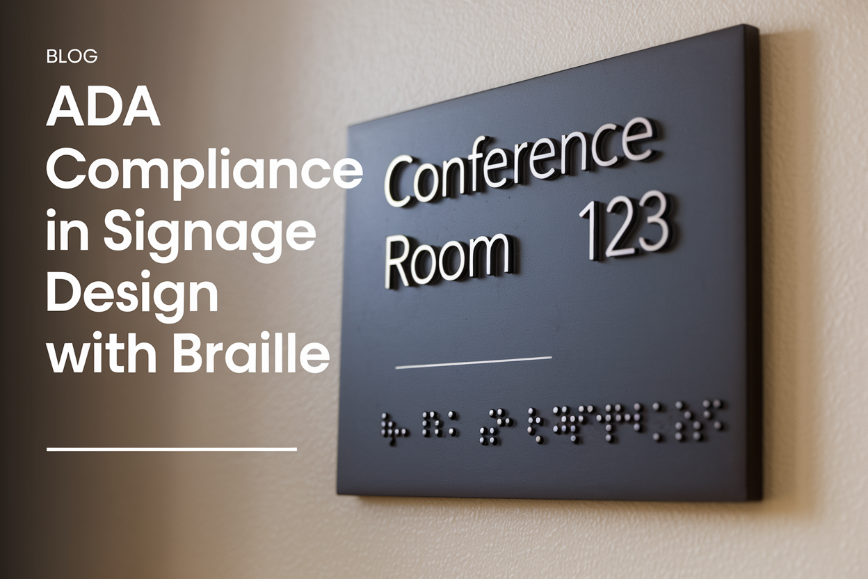
 In a world where visual communication dominates our interactions, the importance of accessible design cannot be overstated. Imagine wandering through a bustling city or navigating a complex building—signage serves as our guide, providing essential information and direction. Yet, for many individuals with disabilities, poorly designed or non-compliant signage can transform these journeys into frustrating obstacles. Enter the Americans with Disabilities Act (ADA), a cornerstone legislation that not only champions accessibility but also redefines how we approach signage design. This article delves into the principles of ADA compliance in signage, exploring its significance, the impact it has on inclusivity, and how thoughtful design can foster environments where everyone can navigate with ease and confidence. Join us as we uncover the intersection of creativity and compliance, illuminating the pathways toward a more accessible world.
Understanding the Essentials of ADA Compliance in Signage
When designing signage that complies with the Americans with Disabilities Act (ADA), several key factors must be taken into consideration to ensure accessibility for all individuals. Text size and font choice are pivotal; signage should utilize sans-serif fonts that are easily legible and maintain a minimum text height. Furthermore, employing contrasting colors for text and background enhances visibility, while text alignment should be left-justified to assist with reading clarity. It is also essential to incorporate braille and tactile elements for individuals with visual impairments, making it crucial to follow standardized specifications regarding dot size and spacing.
In addition to textual considerations, the placement and overall design of signs play a significant role in ADA compliance. Signs should be installed at an appropriate height, typically between 48 to 60 inches above the ground, and should be located where they can be easily seen and accessed. The use of visual symbols—like universally recognizable icons—can convey information more effectively. Consider the following aspects when designing compliant signage:
- Material: Use non-reflective materials to minimize glare.
- Clear messages: Keep wording concise and to the point.
- Directional signs: Include arrows or graphics to guide users effectively.
Understanding these fundamental principles not only ensures adherence to legal standards but also fosters an inclusive environment. Incorporate these elements seamlessly into your signage design to create attractive and functional displays that can be utilized by everyone.

Key Design Features for Effective Accessible Communication
Creating signage that is accessible begins with a keen understanding of the diverse needs of users. Signage should incorporate clear typography that is easy to read, using fonts that are sans-serif as they lend themselves to better legibility. Additionally, consider contrast; signs should utilize high-contrast color combinations to assist those with visual impairments. Furthermore, employing pictograms alongside text can provide essential visual cues, breaking language barriers and enhancing understanding. All signs should be situated at appropriate heights and positions to ensure they are easily seen and reached by individuals with mobility devices.
Another vital aspect of effective communication through signage is the inclusion of tactile elements. Braille should be a fundamental component of any installation, ensuring information is accessible for those who rely on touch. In tandem with tactile features, consider identifying sounds or lighting effects to provide additional context for visually impaired individuals. To ensure that the design aligns with best practices, a table outlining key design features can help to streamline the process:
| Feature | Importance |
|---|---|
| Clear Typography | Enhances readability for all users |
| High Contrast | Improves visibility for individuals with low vision |
| Pictograms | Aids in quick comprehension |
| Tactile Signs | Provides access to information for visually impaired individuals |
Practical Tips for Implementing ADA Guidelines in Signage Projects
Implementing the ADA guidelines in signage design requires a thoughtful approach that combines functionality and aesthetics. To ensure accessibility, consider the following essential elements:
- Contrast: Use high contrast between text and background colors to enhance readability for individuals with visual impairments.
- Text Size: Opt for a minimum font size of Braille 1/2 inch, making sure it is legible from a distance.
- Character Height: Adhere to the recommended height guidelines based on the viewing distance; typically, taller letters are needed for longer distances.
- Font Style: Choose simple, sans-serif fonts that are easy to read and understand.
- Placement: Position signs at an appropriate height (usually 60 inches above the ground) and ensure they’re placed in visible locations.
Moreover, incorporating Braille and tactile elements into your signage will significantly enhance communication for all users. Below is a simple table outlining critical components to have in mind when designing your ADA-compliant signs:
| Component | ADA Requirement |
|---|---|
| Text Contrast | Minimum 70% contrast ratio |
| Font Size | At least 1/2 inch high for raised characters |
| Braille | Every sign should have Braille beneath text |
| Sign Mounting Height | 60 inches from the ground |
The Way Forward
the journey towards ADA compliance in signage design is one of both responsibility and innovation. As we strive to create inclusive spaces that embrace people of all abilities, it is essential to recognize that effective signage is not merely a regulatory requirement but a vital aspect of fostering accessibility and equal opportunity. By thoughtfully integrating tactile elements, high-contrast visuals, and clear, concise information, designers can transform ordinary spaces into welcoming environments for everyone. As we move forward, let us commit to an ongoing dialog about accessibility, ensuring that our creative solutions continue to evolve and resonate with the diverse communities we serve. Embracing the principles of ADA compliance is not only a step towards legal adherence but a stride toward a more equitable future, where every individual can navigate their surroundings with confidence and ease.

