


Logo design trends are changing fast and what looked stylish last year already feels outdated. But here’s a curveball. Minimalist logos are helping brands connect better by stripping away clutter and making messages 60 percent easier to remember. This shift means the simplest ideas are now the boldest moves in modern branding.
Table of Contents
- Embrace Minimalism In Logo Designing For 2025
- Bold Typography: Making A Statement
- Utilizing Vibrant Gradients For Depth
- Hand-Drawn Elements For A Personal Touch
- Adaptive Logos For Flexible Branding
- Designing With Eco-Friendliness In Mind
- Incorporating Motion Into Logo Designs
Quick Summary
| Takeaway | Explanation |
|---|---|
| Embrace Minimalist Logo Designs | Focus on simplicity with clean lines and essential elements to convey brand identity. |
| Utilize Bold Typography Strategically | Choose strong, assertive fonts that reflect your brand’s personality and ensure readability. |
| Experiment with Vibrant Gradients | Use dynamic color transitions to create depth and emotional resonance in your logos. |
| Integrate Hand-drawn Elements | Add organic, personal touches to communicate warmth and authenticity in your branding. |
| Adopt Adaptive Logos for Flexibility | Create logos that can adjust to diverse platforms while maintaining brand recognition and clarity. |
1: Embrace Minimalism in Logo Designing for 2025
In the fast-paced world of visual branding, minimalism continues to emerge as a powerful design philosophy transforming logo creation. This trend strips away unnecessary complexity, focusing on clean lines, essential elements, and strategic simplicity that communicates a brand’s core message with remarkable clarity.
Minimalist logo design represents more than just aesthetic reduction. It reflects a sophisticated understanding of communication where less becomes profoundly more. Businesses across South Florida and nationwide are recognizing that elegant simplicity speaks volumes about their professional identity.
Key characteristics of minimalist logo design in 2025 include:
- Geometric precision with purposeful negative space
- Monochromatic or extremely limited color palettes
- Typography that is clean, modern, and highly legible
- Elimination of decorative elements that do not serve a direct communicative purpose
Successful minimalist logos achieve something extraordinary: they distill complex brand narratives into singular, memorable visual representations. Think of iconic brands like Apple or Nike, whose logos communicate powerful brand stories through remarkably simple designs.
For businesses in competitive markets like Miami, Doral, and Fort Lauderdale, a minimalist logo can distinguish your brand by showcasing sophistication, intentionality, and contemporary design sensibility. The approach demonstrates that your company values clarity, efficiency, and modern aesthetic principles.
Understanding minimalism is not about creating bland or forgettable designs. Instead, it requires strategic creativity to transform complex brand identities into visually striking, instantly recognizable symbols that resonate with target audiences.
As logo design trends for 2025 continue to prioritize clean, purposeful aesthetics, businesses must collaborate with design professionals who understand how to balance simplicity with meaningful brand storytelling. Your logo is often the first visual interaction potential clients have with your brand – make it count.
2: Bold Typography: Making a Statement
In the dynamic landscape of logo design trends for 2025, bold typography emerges as a powerful storytelling mechanism that transforms simple text into a compelling visual statement. Designers are moving beyond traditional typeface selections, crafting logos that communicate brand personality through strong, assertive letterforms.
Bold typography represents more than visual weight. It communicates confidence, establishes brand identity, and creates immediate visual impact across diverse platforms from digital interfaces to physical signage. For businesses in South Florida markets like Miami, Doral, and Fort Lauderdale, this approach offers a strategic way to stand out in competitive landscapes.
Key considerations for implementing bold typography in logo design include:
- Selecting fonts that reflect brand personality
- Maintaining readability across different scales and mediums
- Balancing weight and proportion to create visual harmony
- Ensuring the typography complements other design elements
The most effective bold typographic logos achieve a delicate balance between assertiveness and elegance. They communicate strength without overwhelming the viewer, creating a memorable visual signature that resonates with target audiences.
Modern designers are experimenting with unique typographic treatments. This might involve custom letterforms, strategic letter spacing, unexpected font weights, or creative text manipulations that transform words into graphic elements. Such approaches allow brands to create truly unique visual identities.
Businesses seeking to leverage bold typography should consider how their chosen letterforms reflect core brand values. A law firm might opt for sharp, structured fonts that communicate precision and reliability. A creative agency could choose more fluid, dynamic typefaces that suggest innovation and flexibility.
Successful bold typography in logo design requires understanding visual psychology, typographic principles, and brand communication strategies. It is not merely about selecting a thick font, but about crafting a strategic visual language that speaks directly to your target audience.
As logo design trends continue to prioritize expressive, impactful communication, bold typography stands at the forefront of innovative brand representation.
3: Utilizing Vibrant Gradients for Depth
Vibrant gradients are revolutionizing logo design, transforming static visuals into dynamic, multidimensional brand representations. These sophisticated color transitions offer unprecedented visual depth and emotional resonance, moving far beyond traditional solid color palettes.
In the competitive design landscape of 2025, gradients provide businesses a unique opportunity to create logos that feel alive, energetic, and technologically forward-thinking. From Miami startups to established South Florida enterprises, brands are discovering how strategically crafted gradients can communicate complexity and innovation.
Essential principles for effective gradient logo design include:
- Selecting color combinations that reflect brand personality
- Maintaining readability and visual clarity
- Creating smooth, natural color transitions
- Ensuring gradient works across multiple digital and print platforms
Modern gradient techniques go beyond simple color blending. Sophisticated designers are incorporating multi-stop gradients, subtle color shifts, and unexpected color pairings that create visual intrigue. These approaches transform logos from flat graphics into compelling visual narratives.
Technological advancements in digital design tools have expanded gradient possibilities dramatically. Designers can now create incredibly nuanced color transitions that were impossible just a few years ago. This enables more precise, emotionally resonant brand storytelling through color.
Gradients also offer remarkable versatility. They can communicate warmth through soft, organic color flows or suggest technological innovation through sharp, electric color transitions. A technology company might utilize cool blues and purples, while a wellness brand could leverage warm, organic oranges and yellows.
For businesses in dynamic markets like Doral, Fort Lauderdale, and Miami, gradient logos represent more than aesthetic choice. They signal adaptability, creativity, and an understanding of contemporary design principles.
Successful gradient logo design requires a delicate balance. The goal is not simply to create visual noise, but to craft meaningful color journeys that enhance brand communication and create memorable visual experiences.
4: Hand-drawn Elements for a Personal Touch
Hand-drawn elements are emerging as a powerful storytelling mechanism in logo design, offering brands an opportunity to inject genuine personality and human authenticity into their visual identity. Unlike digital perfection, these organic design elements communicate warmth, creativity, and a unique brand narrative that resonates deeply with audiences.
In the logo design landscape of 2025, hand-drawn elements represent more than a visual trend. They are a strategic communication tool that distinguishes brands in increasingly digital environments. Businesses across South Florida markets like Miami, Doral, and Fort Lauderdale are discovering how these organic design approaches can create meaningful connections.
Key considerations for implementing hand-drawn logo elements include:
- Maintaining balance between organic spontaneity and professional polish
- Ensuring scalability across different design platforms
- Preserving the unique character of the original sketch
- Aligning hand-drawn elements with brand personality
Sophisticated designers are approaching hand-drawn logo elements with surgical precision. They understand that these designs are not about rough sketches, but carefully crafted visual expressions that communicate brand essence through nuanced strokes, intentional line weights, and strategic imperfections.
The power of hand-drawn elements lies in their ability to evoke emotion. A slightly irregular line can communicate playfulness. A confident, bold stroke can suggest strength and determination. These subtle visual cues create narrative depth that traditional digital designs often lack.
Technological advancements have expanded possibilities for integrating hand-drawn elements. Digital tools now allow designers to capture the spontaneity of physical sketches while maintaining crisp, professional output. This means brands can leverage the emotional resonance of hand-drawn design without compromising visual quality.
For businesses seeking to stand out, hand-drawn logo elements offer a compelling differentiator. They signal creativity, reject corporate sterility, and invite audiences into a more personal brand experience. In a world of algorithmic precision, these organic design choices become powerful statements of individuality.
5: Adaptive Logos for Flexible Branding
Adaptive logos represent a revolutionary approach to brand identity, transforming static designs into dynamic visual systems that can seamlessly adjust across diverse platforms and contexts. In 2025, businesses recognize that a single, rigid logo no longer meets the complex communication demands of modern digital landscapes.
The core philosophy of adaptive logos centers on creating flexible visual identities that maintain brand recognition while dynamically responding to different environments. From tiny mobile screens to massive billboards, these logos elegantly scale, shift, and transform without losing their fundamental essence.
Key principles of successful adaptive logo design include:
- Maintaining consistent brand DNA across multiple variations
- Ensuring readability at different sizes and resolutions
- Designing modular elements that can reconfigure strategically
- Creating versions that work effectively in color and monochrome
Sophisticated brands understand that adaptability is not about creating multiple logos, but developing an integrated visual system. This approach allows logos to breathe and flex while preserving core brand identity. A logo might feature intricate details on a website header but simplify dramatically when displayed as a small mobile app icon.
Businesses in dynamic markets like Miami, Doral, and Fort Lauderdale are discovering that adaptive logos offer unprecedented communication flexibility. These designs signal technological savvy, demonstrating a brand’s ability to remain relevant and responsive in rapidly changing environments.
Technological advances have made adaptive logo design more accessible. Advanced design tools and vector graphics enable designers to create complex, responsive visual systems that can dynamically adjust across platforms. This means brands can maintain visual consistency while optimizing for specific contexts.
For forward-thinking organizations, adaptive logos represent more than a design trend. They are a strategic communication approach that acknowledges the multifaceted nature of modern brand interactions. By creating logos that can elegantly transform, businesses communicate adaptability, innovation, and a deep understanding of contemporary visual communication.
6: Designing with Eco-friendliness in Mind
Eco-friendly logo design emerges as a powerful statement of corporate responsibility, transforming visual branding into a sustainable communication strategy. Businesses across South Florida and beyond are recognizing that environmental consciousness can be seamlessly integrated into their visual identity.
Modern logo design is no longer just about aesthetics. It represents a comprehensive approach to reducing environmental impact through strategic material choices, production methods, and design philosophies that prioritize sustainability.
Critical considerations for eco-conscious logo design include:
- Utilizing digital-first design approaches to minimize physical waste
- Selecting sustainable printing materials and processes
- Designing logos that communicate environmental commitment
- Implementing color and design strategies that reduce ink consumption
Innovative designers are exploring groundbreaking approaches to sustainable logo creation. This might involve using recycled digital materials, developing logos that require minimal ink or energy to reproduce, and creating visual identities that inherently communicate environmental values.
Brands in markets like Miami, Doral, and Fort Lauderdale are discovering that eco-friendly design is not a limitation but an opportunity for creative expression. A logo can now tell a story of environmental stewardship, demonstrating a company’s commitment to sustainable practices through its very visual representation.
Technological advancements have dramatically expanded possibilities for sustainable design. Vector graphics, digital optimization techniques, and advanced rendering technologies allow designers to create complex logos with minimal environmental footprint. These approaches reduce material waste, energy consumption, and overall carbon impact of brand visual identities.
For forward-thinking businesses, eco-friendly logo design represents more than a trend. It is a strategic approach to brand communication that acknowledges global environmental challenges while creating visually compelling, responsible brand narratives. By integrating sustainability into their visual identity, companies signal their commitment to a more conscientious future.
7: Incorporating Motion into Logo Designs
Motion design represents the cutting edge of logo evolution, transforming static visual identities into dynamic storytelling platforms. In 2025, brands are discovering that logos can be living, breathing entities that engage audiences through sophisticated animated experiences.
Traditional logo design perspectives are rapidly dissolving. Modern logos are no longer fixed symbols but adaptive, interactive visual systems that communicate brand personality through strategic movement and transformation.
Key principles for successful motion logo design include:
- Creating seamless transitions between different logo states
- Ensuring motion enhances rather than distructs from core brand message
- Developing animations that work across multiple digital platforms
- Maintaining brand consistency through predictable motion patterns
Sophisticated designers understand that motion logos are not merely decorative elements. They represent complex communication tools that can convey emotion, suggest functionality, and create memorable brand interactions within milliseconds of animation.
Businesses across South Florida markets like Miami, Doral, and Fort Lauderdale are recognizing how motion can differentiate their brand. An insurance company might use subtle, reassuring movements that suggest stability. A technology startup could leverage more dynamic, energetic animations that communicate innovation.
Technological advancements have dramatically expanded motion design possibilities. Advanced software and web technologies allow designers to create intricate, responsive logo animations that adapt seamlessly across devices and platforms. These motion designs can react to user interactions, providing personalized brand experiences.
For forward-thinking organizations, motion logos represent more than visual trends. They are strategic communication mechanisms that acknowledge the increasingly interactive, digital nature of brand experiences. By integrating thoughtful motion design, companies can create logos that do not just represent their brand but actively engage and communicate with their audience.
Below is a comprehensive table summarizing the 7 key logo design trends for 2025 discussed in the article, with main focus, core elements, and the benefits for modern businesses.
| Logo Design Trend | Core Elements | Key Benefits for Businesses |
|---|---|---|
| Minimalist Logos | Clean lines, essential elements, geometric precision, minimal color use | Enhances memorability, signals sophistication, clear communication |
| Bold Typography | Strong, assertive fonts, custom letterforms, visual weight | Communicates confidence, improves recognition, makes statements |
| Vibrant Gradients | Dynamic color transitions, multi-stop gradients, smooth blends | Adds emotional depth, conveys innovation, creates strong impressions |
| Hand-drawn Elements | Organic strokes, unique sketches, deliberate imperfections | Injects personality, conveys authenticity, fosters connection |
| Adaptive Logos | Modular design, scalable elements, visual consistency across platforms | Boosts flexibility, ensures clarity in any context, modern branding |
| Eco-friendly Logo Design | Digital-first approach, sustainable materials, minimalistic color & ink | Shows environmental commitment, reduces waste, appeals to values |
| Motion in Logo Design | Animated transitions, responsive movement, cross-platform compatibility | Engages audiences, adds dynamism, strengthens storytelling |
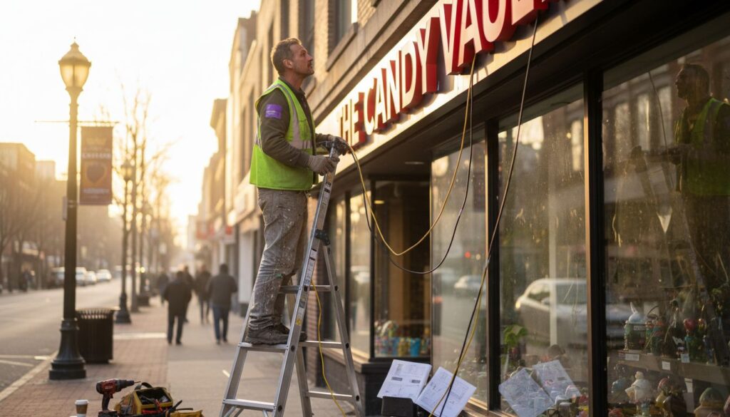
Bring Your 2025 Logo Vision to Life with Titans of Print
You learned in our article how modern logo trends like minimalism, bold typography, and vibrant gradients can make your business stand out in Miami’s competitive market. But making these design trends work for your brand is often challenging. Many businesses struggle to translate a new logo into effective building signs or professional trade show materials. When your brand’s first impression relies on getting these details right, the risk of looking outdated or inconsistent can be stressful.
That is where Titans of Print makes a difference. Our expert team understands the importance of turning current design trends into real-world, eye-catching signage and marketing materials. Whether you want sleek channel letter signs, refreshing lobby logo displays or custom tradeshow assets that match your updated brand identity, we handle everything from printing to installation. Do not wait to make your new logo a reality. Visit Titans of Print and take the first step toward a stronger brand presence today.
Frequently Asked Questions
What are the key characteristics of minimalist logo design for 2025?
Minimalist logo design focuses on geometric precision, monochromatic color palettes, clean typography, and the elimination of decorative elements that do not enhance the brand’s message.
How does bold typography enhance a logo’s effectiveness?
Bold typography communicates confidence and establishes brand identity, creating immediate visual impact and enabling brands to stand out in a competitive landscape.
What are the benefits of using vibrant gradients in logo design?
Vibrant gradients add visual depth and emotional resonance, transforming static logos into dynamic representations that communicate the brand’s complexity and innovation.
Why should businesses consider incorporating motion into their logo designs?
Incorporating motion into logo designs creates a dynamic storytelling platform that engages audiences more effectively, allowing logos to convey emotion and functionality through animation.